Research into interaction paradigms and the investigation of interfaces were a primary focus for ART+COM in the early years. At the time, our interests shifted from universal to content-specific interfaces. Early on we developed semantic interfaces that were intuitive to use and quasi-self explanatory.
Misused technology, content specific and semantic interfaces
Through various channels, ART+COM had access to cutting-edge technology at the beginning of the 1990s, even before practical applications had been found for much of it. In 1991, a pair of data goggles and a data glove were made available to us as the first European designer and developer by VPL Research, Inc., a company co-founded by Jaron Lanier in 1985.
In experiments with these hyped-by-the-press VR interfaces we found that interaction using the data goggles, isolated from the outside world, wasn’t user friendly. The lack of real-world spatial references proved too restrictive, so we set aside testing with the goggles and turned to navigating the 3D world with a data glove alone.
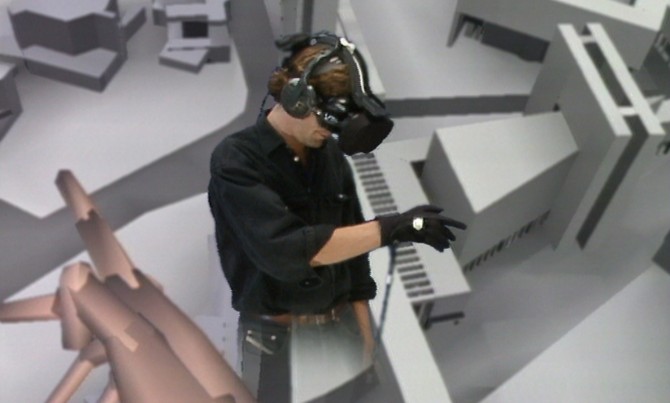
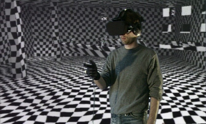
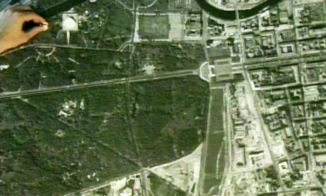
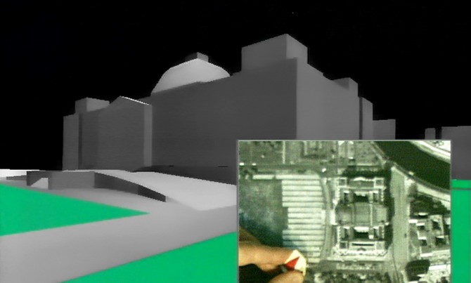
In 1992 we took the Polhemus sensor, which was originally in the glasses, and installed it over an areal view of Berlin to navigate through a three-dimensional model of the city. Through this misappropriation and the direct coupling of real and virtual space, users of the Berlin — Cyber City (1989-91) could move intuitively through the virtual Berlin to, for example, consider and evaluate land-usage plans.
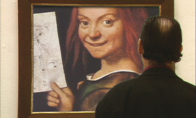
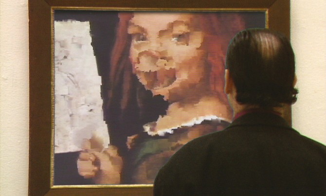
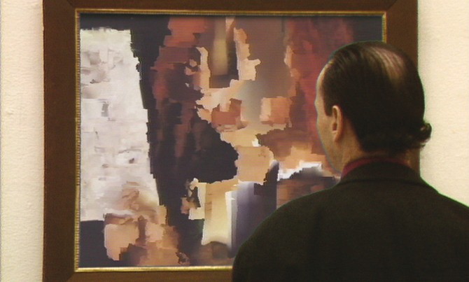
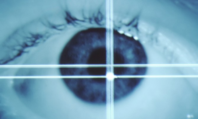
Eye-Tracking consisting of a camera, an infra-red light, a computer and video-tracking software — innovative for the time — was in the first instance used for military research as an analytical tool in perceptual research rather than applied to classic user interaction. We misused the system as an interface in De-Viewer (1992) to provocatively propagate the then underestimated concept of interactivity in art.
The reception process of De-Viewer is simultaneously a design process: the camera makes a recording of the viewer’s eye, which is then analysed in real time by software to detect the centre of the iris and the reflection point of infrared light in the eye. From this data, the point that the viewer is looking at in the digital painting is calculated. The spot is then changed via a generative algorithm in real time, as is the entire succession of points looked at by the viewer. Through experimentation we noticed how precisely and intuitively people can move through space with just eye movements and use them as an interface for the navigation of virtual worlds and projects like Berlin — Cyber City.
In comparison with general-purpose interfaces, content-specific interfaces have the advantage of restricting the spectrum of interaction and guiding the user in such a way that they are able to concentrate on the content. Additionally, they can be designed semantically so that their function is immediately clear.
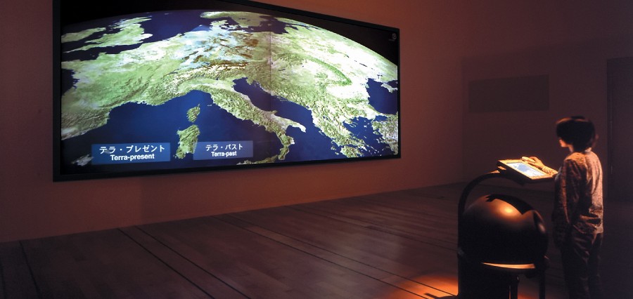
An early example of a semantic interface was the Earthtracker, one of the three interface components of Terravision (1994). The Earthtracker was a physical model globe for navigating around virtual Earth and through several hidden layers of information. It created a direct, semantic and intuitive understandable connection between virtual and real space. In a technical sense, the Earthtracker was derived from the trackball of a computer mouse: the in-house developed system consisted of three trackballs on which a large ball lay. In a mouse, the trackball has a purely technical function — isolated, enlarged and placed in the context of Terravision it became a semantic, sculptural globe interface.
A SpaceMouse was used as an additional interface with which users could navigate spatially. In a later version of Terravision the two interfaces were supplemented by a touchscreen for interacting with the information. The combination of two general-purpose interfaces and an in-house developed, semantic interface enabled an intuitive, multi-layered navigation process. The viewed object was controlled with the trackball, the observer’s viewpoint via the SpaceMouse, and interaction with the hidden information was made possible via touchscreen.
Likewise for the project Window into Virtuality (1997), two alternatives to the usual VR interfaces of the time were developed. At the centre of the installation stood a virtual, three-dimensional object — a full-scale, photorealistic car. Users could move around it, view it from all possible angles and even see interior details up close. This was made possible through a mobile touchscreen mounted on a telescopic arm that could be moved by users through space — towards, around and into the car. The touchscreen could be used to retrieve information about the vehicle and it could be configured with all available variations.
The system was built to scale so that when the user moved a metre in physical space, there was simultaneously one metre of movement in virtual space. This resulted in an absolute navigation by which movement in physical space corresponded to movement in virtual space. An alternative to the large-scale system with absolute navigation, an approach developed in parallel featured relative navigation. It consisted of a single monitor attached to a high base, held with two hands and pushed and pulled to navigate virtual space. A two-handed push moved the viewer forwards; a pull, backwards and a one-handed push generated a swivel.
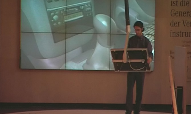
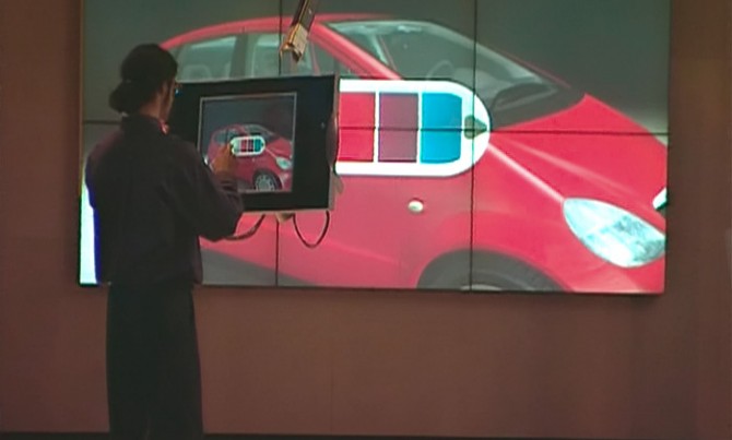
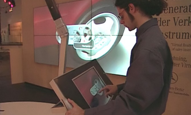
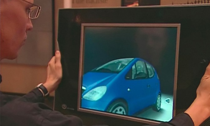
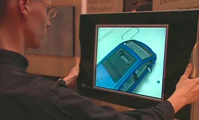
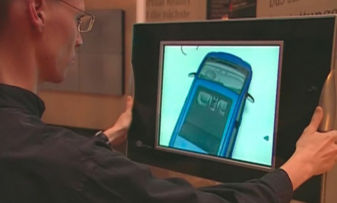
The two Window into Virtuality interfaces were based on experiments with the first available LCD monitor from the early 1990s. We made the monitor mobile, outfitted it with a Polhemus sensor and mounted a video camera on the reverse side. The screen showed the image in front of the camera, just as today’s tablets do; the interface became quasi transparent. With the help of data from the position sensors the image could be overlaid with a position-accurate virtual model. For Window into Virtuality some of the predecessor’s features were deliberately dispensed with. The telescopic arm restricted spatial movement, which contributed to an ease of use and targeted communication of content. In addition, the virtual car was purposely not overlaid with a camera image of the environment, but represented in a virtual space.
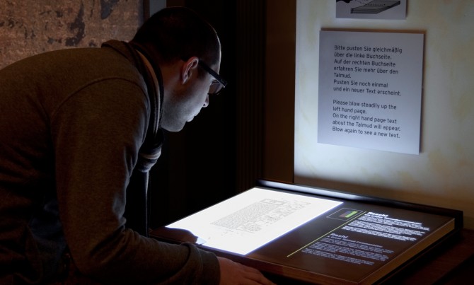
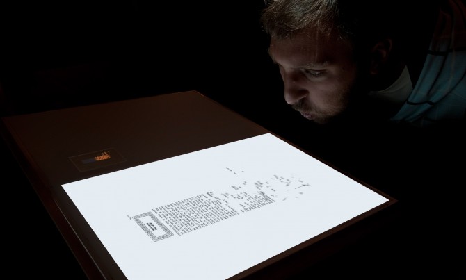
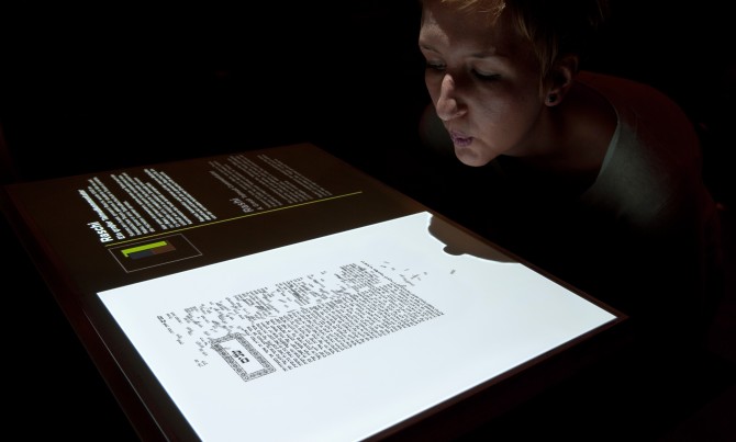
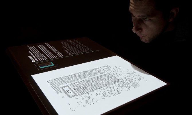
The conceptual departure point for the semantic interface of Odem (2001) was the initially oral proclamation and lore of the Talmud and teachings on the life-giving breath of God. A wind sensor system was installed as metaphoric reference. In the exhibition, visitors were confronted by an open and seemingly empty book. When a visitor blew on the left side of the book, elements of the Talmud appeared one after the other. Through their breath, visitors made the writing appear, bringing the book to life, so to speak.
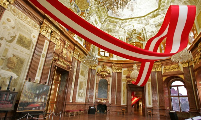
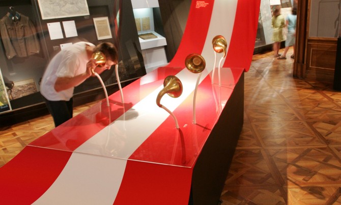
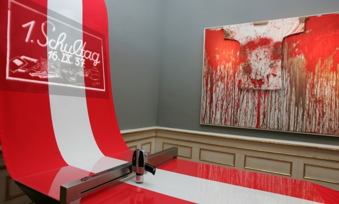
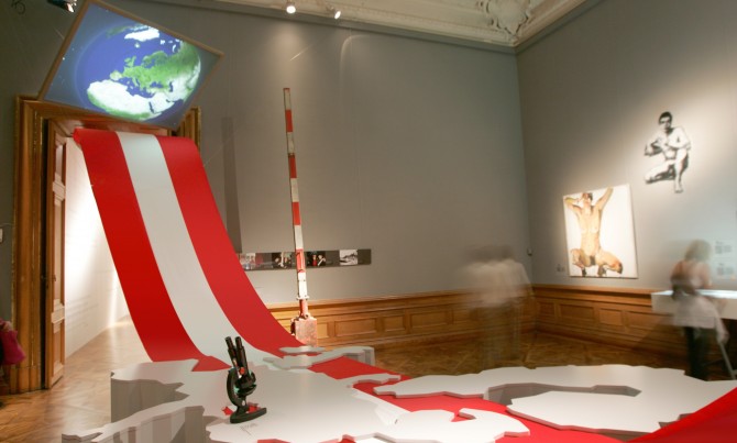
For the exhibition The New Austria (2005) an installation was developed in the form of a 250 metre Austrian flag, which wound through Belvedere Palace and contained seventeen media installations. Visitors could explore a series of exhibits, such as historic recordings and films, along the flag. For the design of the semantic interfaces, we misused fairly common equipment appropriate to the content and method of interaction. With a microscope, visitors could zoom in from outer space down into Austria and onto themselves. Bending down to ear trumpets, they could also listen to the voice of Emperor Franz Josef, too quiet to hear unless closely approached.
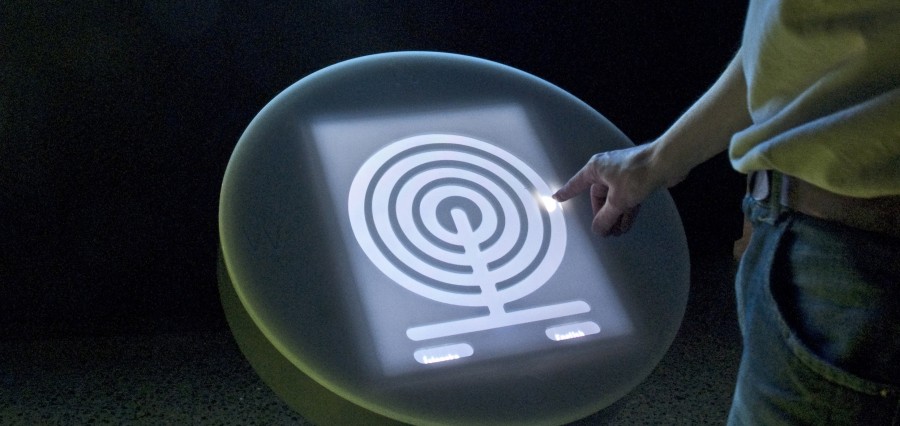
In the museum exhibition Reykjavik871+/-2 (2006) we were to articulate the shape and structure of Iceland’s earliest longhouse. We visualised the building based on the corpus of archaeological finds and scientific evaluations. At the installation Archaeological Window, which we developed accordingly, visitors can see the longhouse from all sides and follow each building stage in an animation. The first thoughts for the interface led to a mechanical crank that visitors could use to turn the exhibition and see the longhouse from all angles, however the development of a mechanism that also allowed a second level of interaction proved highly complex. In the end the solution lay in the modification of a general-purpose interface — a touchscreen with a Plexiglas mask fixed to it. As the exhibition visitor traces a finger along the axial timeline, the longhouse is revealed layer by layer. By moving a finger along one of the circles, the longhouse and its environment can be revolved, creating the impression of flying around the longhouse in each stage of construction selected. The minimalistic interface efficiently guides, limits and focuses user interaction. The feel of the interface makes it possible for visitors to concentrate completely on the longhouse appearing on the wall monitor when following the grooves with just their fingers.
The disappearance of interfaces
In 1992 De-Viewer was still a unique, avant-garde example of human-machine interaction without any physical interface. By the end of the 1990s, ART+COM was researching — in addition to semantic interfaces — the strengthening of systems that enabled the body to interact directly with virtual objects.
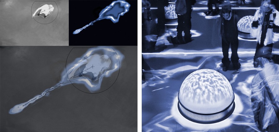
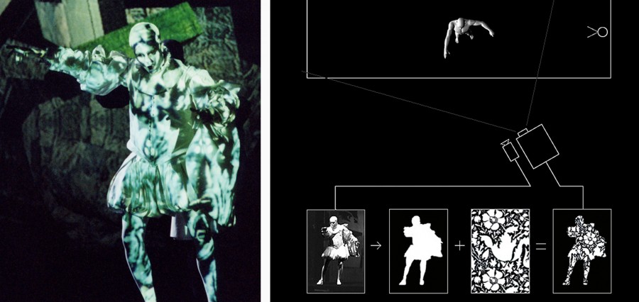
In parallel we worked on the design of the installation Bodymover (2000) and virtual set design for the opera The Jew of Malta (2002). Both were based on the same principle: the combination of camera tracking, real-time analyses of silhouettes and real-time projection.
The opera’s protagonist is Machiavelli, who is powerful at the beginning but loses his power over the course of the play. This was the conceptual starting point for the design of the interactive stage set, which became an active element of the opera, not just a place for action. The costume design, which involved projecting textures onto singers who moved around the stage, had to be extremely precise, so a great deal of development work went into the software that calculated virtual masks from the camera images.
ART+COM’s search for alternative interfaces that allow direct, bodily interaction with virtual objects and the simultaneous interaction of multiple users, has led to a series of sensitive surfaces based technically on capacity sensors, from floors to tables to free, unplanned forms. More on the subject of sensitive surfaces here.